UI Design Principles for mobile Application Design|Ariel Chang
UI design is attractive due to the universality of the UI design principles. It is the ultimate creative game within the rules. To add meaning and value to the product, designers with need-to-know UI skills subtly dance on a filament when many factors are vague and uncertain. Here is a list of principles which precisely exist for such kind of art.

1.The axis
The axis is the most essential and common concept in UI design principle and the core of organizing interface structure. Frankly speaking, an axis is commonly seen in the using of symmetric structure elements. When the elements are distributed symmetrically, the whole interface would present a sense of order. In real life, people enjoy seeing things well-aligned because they make us feel steady, smooth, and friendly.
2.The intensity
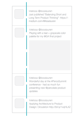
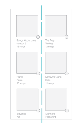
Although the axis is an invisible line, it would be more evident in our eyes if the edges of the peripheral elements are neatly controlled. The best example is the urban roads. We can assume that the street lamps make up the axis between two buildings. If you remove the building on one side, the axis would become more blurry. From the perspective of UI design principles, we can take the timeline of Twitter as an example. The avatars on the left side and the twits on the right side combine to create a feeling of the axis.
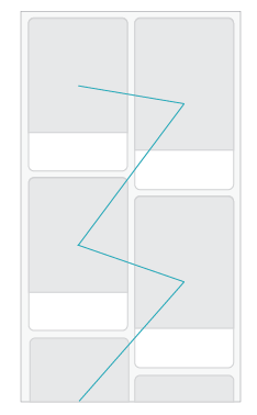
3. The dynamic effect
When we see some lines, the point where we fix our eyes on would naturally move following the direction. When we are standing on a street, we would naturally begin to observe the street from one end to another. The two endpoints of the line determine where our view begins and ends. In other words, the existence of the lines and axis would guide and hint the direction of the dynamic effect.
4. Symmetric and asymmetric
When the elements are uniformly distributed on both sides of the axis, they actually constitute a symmetric relationship. And when they are correspondingly placed, a perfect symmetry is formed. Symmetry provides your design with a sense of balance. This kind of design can guide users to read naturally from top to bottom.
Asymmetric is another choice, in which, elements are no longer correspond to each other. In Pinterest App, the asymmetry perfectly breaks the law of balance but creates the imperfect beauty to reduce the visual fatigue bought by the regularity of the interface.
5.The rhythm
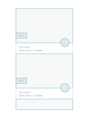
The beauty of rhythm can also be applied to UI design while the repetition can build a shortcut for users to take. In the Airbnb App, every house in the list is restricted in a fixed module. Every module contains a photo, a price, a location of the same size. The familiar rhythm would automatically tell users where to find the information they need. Here is the interesting part, when the rhythm is interrupted like when you are listening to the music, users would immediately discover that it is the special part. The special part can break the whole information flow to highlight a sense of hierarchy which would tell users the relationship of different contents.
It’s not really difficult to grasp these UI design principles for even new designers. Here are also 7 rules for creating gorgeous UI, Try them and tell me the results.


Comentarios
Publicar un comentario